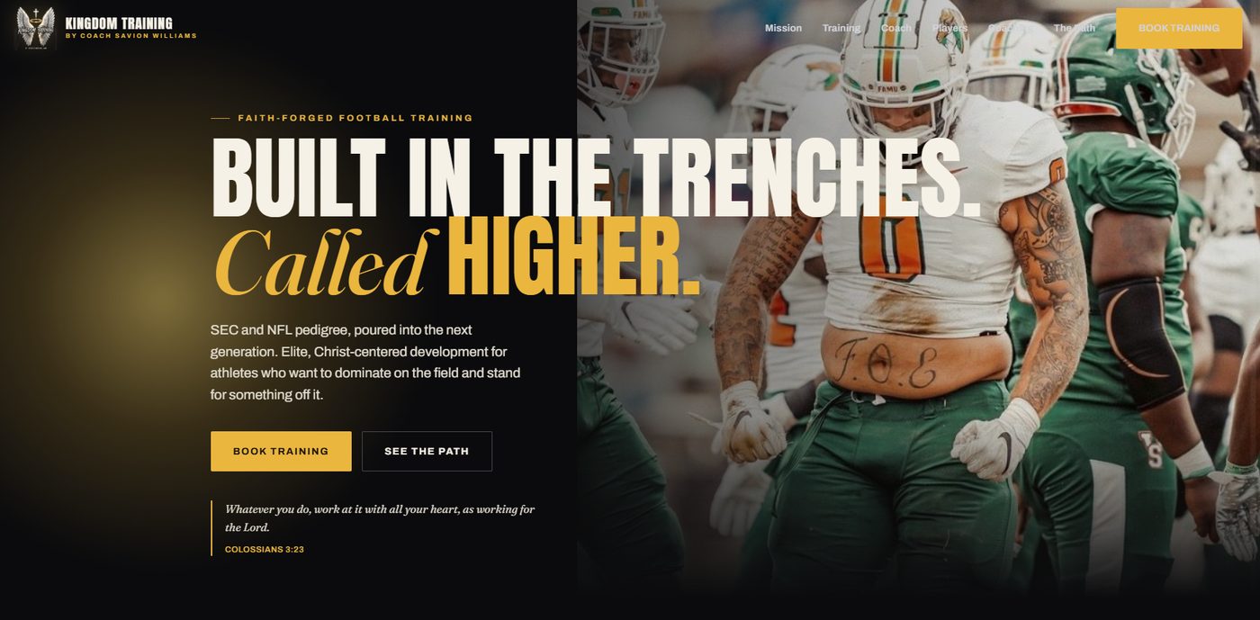
Your logo does its job in about a second and a half. That’s roughly how long it takes a prospect to form a first impression of your business, before they’ve read a word of your pitch. If that impression says “outdated” or “DIY,” you’re fighting an uphill battle before the conversation even starts.
Here are seven honest signs it’s time for a change, and how to tell whether you need a full redesign or a lighter refresh.
1. It doesn’t scale down cleanly
If your logo turns into an unreadable smudge as a social media profile photo or a favicon, that’s an immediate red flag. Modern logos need to work at 32 pixels and 32 feet. If yours only works at one size, it’s overdue for an update.
2. It was built as a low-resolution file
Many older logos were saved as basic image files instead of vector formats (like .AI or .SVG). That’s fine for a small web thumbnail, but it means the logo turns fuzzy or pixelated the moment it’s used on a banner, a large monitor, or even a modern high-resolution phone screen.
3. It leans on dated design trends
Gradients, bevels, drop shadows, and busy clip-art icons were common a decade ago and now read as visibly of a specific era. Design trends shift; a logo frozen in an earlier design era makes the business behind it look frozen too, whether or not that’s true.
4. Your business has outgrown it
If you’ve expanded services, moved upmarket, or changed who you actually serve since the logo was made, it may still be describing a version of your business that no longer exists. A landscaper who now does full outdoor living design needs a different visual than the one who just mowed lawns five years ago.
5. It blends in with competitors
A generic mark, especially one that leans on the most obvious symbol in your industry, makes you harder to tell apart from every other business a prospect is comparing you against. Distinctiveness is worth more than cleverness here.
6. You find yourself explaining it
If you regularly catch yourself saying “it’s supposed to look like…” or apologizing for it before a client sees it, that’s a strong signal it’s not doing its job. A logo should require zero explanation.
7. It’s inconsistent across platforms
Different colors on your website versus your social profiles versus your signage isn’t a small thing. Inconsistency undermines the “professional, established business” impression a brand is supposed to build.
Refresh or full redesign: how to tell the difference
A full redesign starts from scratch. A refresh keeps your recognizable core elements (an icon, an initial, a color you’re known for) and modernizes the execution: better typography, cleaner spacing, proper file formats. Most businesses that hit 2 to 3 of the signs above need a refresh, not a total rebuild. If your business has fundamentally repositioned (new name, new market, new positioning), a full redesign is usually the better investment.
FAQ
How much does a logo redesign cost?
Pricing generally runs anywhere from a few hundred dollars for a refresh of an existing mark to a few thousand for a full custom identity system with a style guide, depending on scope.
How often should a business update its logo?
There’s no fixed timeline. It depends on how the business itself has changed, not the calendar. A logo that still accurately represents the business rarely needs touching; one that no longer does needs attention regardless of its age.
Will a redesign hurt my brand recognition?
Not if it’s done as a refresh rather than a total overhaul. Keeping a recognizable core element (color, icon, or initial) while modernizing the execution preserves recognition while fixing what’s dated.
Curious whether your current logo is helping or hurting?
Book a free discovery call and we’ll give you an honest read, with no pressure. See our Logo Redesign packages if you already know it’s time.
Book a Discovery Call